Tuesday, June 29, 2010

Business card final


Here's what I decided on for my business card. I haven't received them yet, but I ordered them through overnightprints.com. My excellent teacher Dave Chow suggested the website to me, and it's great because there are tons of coupon codes you can find on the internet that work. I got 100 premium business cards for free! So, it's worth checking out.

Sunday, June 27, 2010

Lee and Joan Schoenherr


Sorry I haven't been posting my progress recently, I've just been concentrating pretty hard on getting this one right.

Lee and Joan Schoenherr own Floracraft here in Ludington. Don't think that means anything to you, my dear Detroit friends? Well, let me just say that Floracraft ships their products worldwide. They are the largest fabricator and supplier of styrofoam. That's right styrofoam(tm). I can guarantee that just about every Michael's craft store you've ever been to has Floracraft products. And Floracraft has been in business for 60 years! Congrats to them!

Apart from being successful business owners, the reason I'm painting Lee and Joan is because they are also extremely philanthropic people. For instance, they have donated this sculpture, entitled "Reflections" to our marina, which happens to also be my favorite:


Philanthropic, and have good taste! I haven't had a chance to really sit down and discuss the ins and outs of why the Schoenherr's enjoy and stay in Ludington, but I will when I return the reference photos I borrowed from Joan. The Schoenherr's are also very busy people, and for that reason I have borrowed several photos from which I'm drawing my reference from. Here's the piece so far. It's given me a little more grief than Todd and Brad. For instance, there is something in the eyes of Lee that is off and I just haven't nailed it yet. It's ruining the likeness, so it's going to take some more careful consideration. Also, hands aren't done, and there are little details yet, but I wanted to show off something. I should finish by tomorrow, and then, on to the next!

Wednesday, June 23, 2010

And now for something completely different....

Business cards! It's about time I had some, and they will come in quite handy when I go to ICON in a couple weeks in Pasadena. Won't you please let me know which of these you prefer? I'm leaning towards Anna Lisa, but I do like the clean look of the black buck.


Friday, June 18, 2010

Todd and Brad Reed Progress


To do:
-HANDS
-Todd coat
-bottom of camera
-Brad pants
-lighter in Brad's hair
-corners of Todd's mouth
-glaze grass yellow
-Brad left eye?
-light on Brad's ear
-Brad elbow too crisp
-Todd eyebrows?
-glaze all when dry

Wednesday, June 16, 2010

Dr. Anderson completed, Todd and Brad progress

Well, here he is! He turned out just dandy. Unfortunately, I cannot for the life of me get the lighting to reveal the correct colors. All of my camera settings are either too yellow, or too blue, or too dark or too light. This is a little too yellow, and too bright. I should really learn more about my camera, or get a slightly more advanced one anyway (another thing to add to the list of things to get before I'm out of school!) But trust me, the painting is lovely in person.


Also, here is part of yesterday's and today's progress with Todd and Brad. It's coming along nicely, but wouldn't you know it... guess who STILL didn't set down her darkest darks to compare the other values to? !!!!!! GAH! Maybe if I repaint the shadow portion of the third and fourth faces of this project, maybe THEN I will FINALLY learn to set down all of the LIGHTS and all of the DARKS in the BEGINNING! Anyway... it will just fine, but it is something I really have to remind myself to do as a painter.


To those of you non painters, what I'm experiencing with the shadows on the skin tones in my paintings is kind of like this optical illusion. A and B are actually the same color, but A looks darker and B looks lighter. Why? Because A is next to a much lighter color. The light square and A really are that different, but in comparison to black, or to a much darker grey like the squares next to B, that color is actually quite light. In an effort to not rest my hand in paint, I've tried to paint the faces of my portraits first. They look great, until I add all of the surrounding darks, and then, like moving square A for square B, I now have a 30% dark value as opposed to what I thought was a 70% when all that was around the paint was white canvas. Does that make sense? So yes. Something to definitely work on. Save myself some time and effort!

Tuesday, June 15, 2010

Todd and Brad Reed

I know I haven't posted the final painting of Dr. Bill Anderson, but there are some final touch ups to be done once the painting isn't so wet. Actually, that might get to happen today. We shall see! In any case, it should be completely done very soon.

Next up: Todd and Brad Reed. The Reeds are a very artistic bunch. Todd has been photographing the Ludington area and Michigan for many years, and Brad has joined the family business within the last few years. On a side note, Todd's nephew Ryan Reed is also a photographer, and has recently done a project in Sudan. You can visit Ryan's website here.

But back to Todd and Brad. Those of you who know me well know that photography is not something I get excited about very easily. Maybe it's because it is so accessible these days that anyone feels they can call themselves a photographer. That being said, I have always enjoyed the Reed's photographs. Photographing a tourist trap like Ludington and still being able to create pieces that are unique and interesting to look at is no small feat. Todd and Brad really know how to capture the essence of Ludington and Michigan without doing anything that feels overdone or tiresome, or anything that relies too heavily on camera "tricks". And that is what I find so appealing about their work. Also, I just really enjoy the subject matter! In addition to their great photographs, the work they do really does a lot to help stimulate the Ludington economy (for instance, they try to work with local businesses- I know this because in the past I have had to cut and put together 1,000+ double mats for their pieces when I worked at the Artist Market). For that reason, they have also been named business of the year here in Ludington. Lastly, they are all really nice and exceptional people. And that really makes it a joy to work on this particular portrait. You can visit Todd and Brad's website here.

Todd and Brad were nice enough to supply me with some of their own photographs to work from, because I wanted to do a painting of them in the field. Some of you may feel this is cheating, but let me just say that no illustrator works strictly from one photograph. In fact, a lot of it becomes intuition, or artistic license. There are problems with every photograph for an artist. For instance, look at this great one that I'm pulling most of my reference from


Looks great right? Well yes, the lighting is very nice, and I like the green background because the other portraits are mostly blue... but there is the issue of both of them squinting. This can cause more wrinkles than necessary to create a likeness, and may even give the impression of disgust or anger if done strictly from a photograph. Therefore, it is necessary to work from more than one photograph to come to a nice in between squint that will help to make them look a little more natural- and the viewer will never know! The intuition I feel comes most handy when it comes to color. I like to retain realism in my work, but I love pushing color just a little more than it looks in reality on skin tones. I feel it just makes the work so much more interesting. If I made everything look exactly like a photograph, how interesting would that be for me or my viewers looking at paintings? Also, intuition and know how come into play as far as brush strokes and edges. Interest can be created by doing tight detail in the area of focus, and then "blurring" (I don't like that word here, it's a little misleading) the edges that are unimportant. That is a simplified explanation of what I'm trying to do.

Lastly, here's the sketch of the heads I will be using. I know it's not the best photo of the sketch, but notice how the eyes are a little wider, yet still squinted, and how I've made the decision to make Brad smile with teeth as opposed to the photo version where his mouth is pursed. He looks like he's really tired of squinting in the sun. Also, here's the color studies. I like the top better, and I'm excited about using lots more green and less blue. I think it will help the work as a whole to not have everything have copious amounts of cobalt blue.


Friday, June 11, 2010

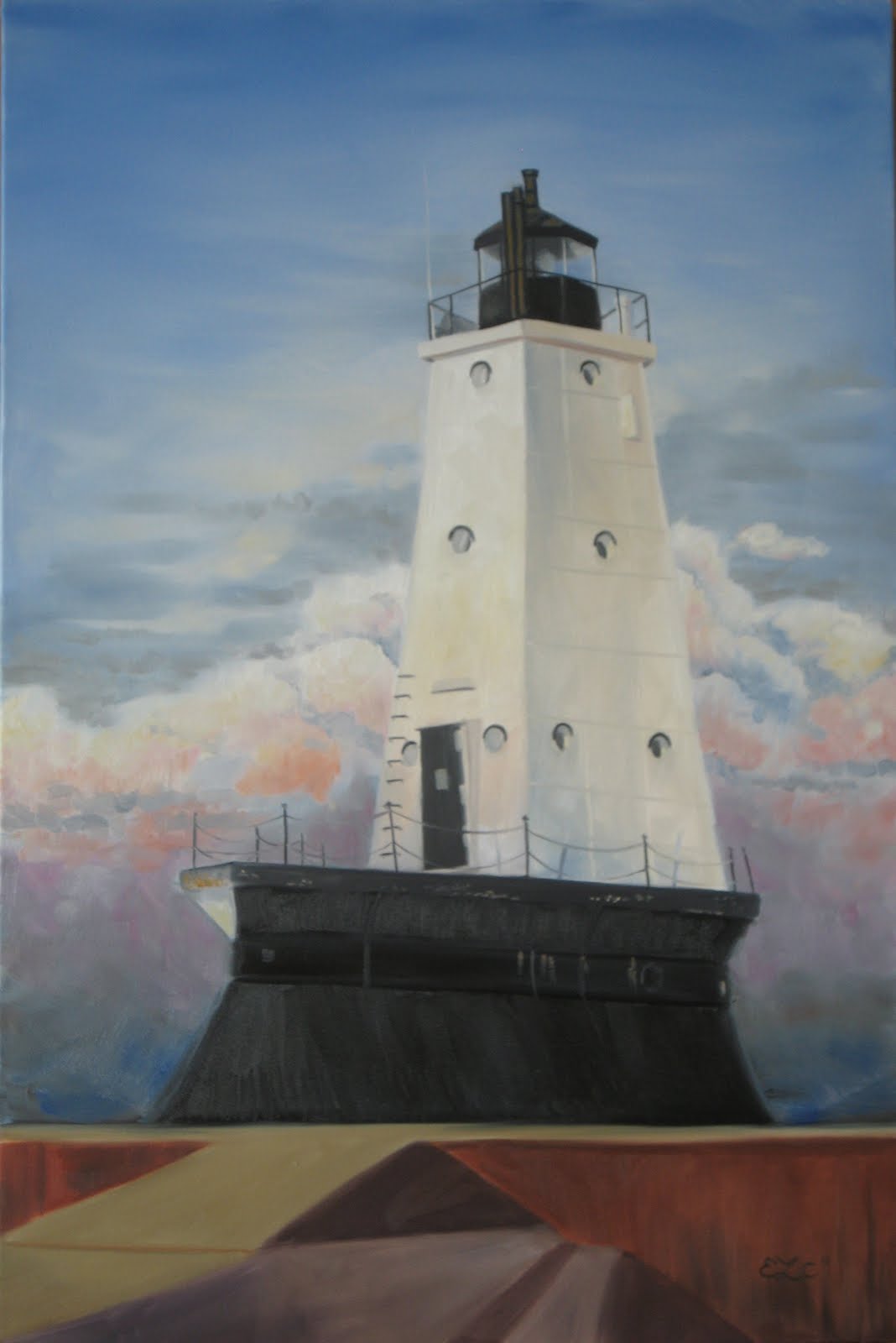
Lighthouse done

Just going to spray it with some Damaar spray varnish and we should be good to go! (I swear by that stuff now. It brings out the darks without making your piece annoyingly shiny) Actually, there may be very small touch ups once it's more dry. But, ta da!