Saturday, December 11, 2010

Lino Cut and Printing

For my Editorial Painting class as our last project of the semester we are illustrating the novella "The Big Wave" by Peter S. Buck. The story is set in the by gone days of Japan, and so I decided that using a similar technique to the Japanese woodblock print would be appropriate. With the help of my friends Veronica, and Ray, and a few instructors, I'm attempting a linoleum print for the first time! Here's the "lino cut".


The linoleum comes as the grey cut away color, so to help me see what I cut away as I worked, I colored over the top of it with a blue sharpie.

Here's a sneak peak of the prints and the process of printing. It's true that in two hours you can kick out near 20 pieces, but it sure can be a messy process with all that ink around!


Oops. Don't itch anything is basically the rule of thumb I learned today. Artists are nice people. I ran into several with my face looking like that, and none of them stared or laughed at me. Just a common workplace hazard I guess.

Thanks again, Veronica. I couldn't have done it without all your help and knowledge!

Monday, December 6, 2010

Some more Fables

Sorry for the delayed posting! This time of year gets pretty busy. Here are some more Fables that will be added to the book. I've also been working a lot on copying the book into InDesign and designing the pages and page numbers.


Tuesday, November 9, 2010

Watercolor Studies


I decided I had some time before bed tonight, so I did an extra little project. I follow James Gurney, of Dinotopia fame, and his fantastic blog daily. Today (er, yesterday, it's 12:18am) he posted a site that compiles random Google map photos of places all over Earth, called Map Crunch. It can give you a more varied feel of the places you want to visit. He then suggested doing little thumbnail watercolors that take no longer than 10 minutes to complete. I did have a blast doing them! Each took no longer than 10 minutes, and as long as that sounds, I wanted to spruce them up more. But the point was to be quick and get to the point (and be looser with the paint and have more fun). From top to bottom, left to right you are looking at Diamond Peak, New Zealand; Morelos, Mexico; Saint-Livres, Switzerland; and South Qu'Appelle, Canada!

Wednesday, November 3, 2010

Scans of Fables


There are still touch ups to be done, pushing value in a few areas, but here are the scans of the three fables I have so far for the inside illustrations.

Final Paintings from the Ludington Show

Remember that show I had a few months ago? Well I finally have nice reproductions of all the paintings in their final state. Let me also just say that the show at the Ludington Arts Center was a hit, and I had so many people attend I couldn't talk to them all! Thanks again to everyone who came and to the Ludington Arts Center for being so generous with the studio they lent me and the space for the show. In order of completion:


Mayor Henderson


Dr. Bill Anderson


Todd and Brad Reed


Lee and Joan Schoenherr


Bob Neal


Bill and Jane Carpenter

Tuesday, November 2, 2010

More Fables


Here are some more illustrated fables that will be illustrations in the book. From left to right: Tortoise and the Hare, Crow and the Pitcher, Lion and the Mouse. Unfortunately, I couldn't scan these individually tonight, so the colors appear washed out. I'll update them soon though. Also, here is a scan of the cover.

Saturday, October 23, 2010

Aesop's Fables Final?


Maybe some touch ups once I get some more feedback.

Aesop's Fables


This new project I'm working on is to redesign the classic book of Aesop's Fables with my own illustrations. This is my progress thus far, although we're nearing completion. Eventually, I hope to actually get the book manufactured so that it is a real product.

I'm centering on the more well known tale of the fox trying to reach the grapes for the cover. The fable goes:

One hot summer’s day a Fox was strolling through an orchard till he came to a bunch of Grapes just ripening on a vine which had been trained over a lofty branch. “Just the things to quench my thirst,” quoth he. Drawing back a few paces, he took a run and a jump, and just missed the bunch. Turning round again with a One, Two, Three, he jumped up, but with no greater success. Again and again he tried after the tempting morsel, but at last had to give it up, and walked away with his nose in the air, saying: “I am sure they are sour.”
IT IS EASY TO DESPISE WHAT YOU CANNOT GET.

And here's my process:


I decide to go with this version. Most people couldn't tell until I explained with this sketch, but imagine that we're by the grapes on top of a wall looking down at the fox, and he's looking up at the grapes he can't reach.

This is my final sketch, although I scale down the fox to make the grapes seem more out of reach and to allow for more room for my book title. I'm still deciding now that I see how the project is turning out whether or not I should include the parade of animals at the top, or if I should think of something else.

Beginning to ink in.

Ink detail.

Wednesday, August 4, 2010

Glazes, Neal, and the final portrait!

I am pleased to announce, that with a little more than a week to go, I have begun THE FINAL PAINTING! Soon, dear followers, you will see the entire show in it's finished glory.


One of the steps to attaining that glory is a glaze I've been putting on once the painting is dry. My glaze is a mixture of ideas from Marsha Steinberg, my painting teacher back at Lorenzo de' Medici, and this guy, Jonathan Linton. Previously, on my Anna Lisa painting, I had used Marsha's medium mix of 2 parts stand oil to 1 part linseed, 1 part essence of turpentine, and 1 part damaar varnish. Recently though, I came across Mr. Linton's blog via the blog of James Gurney of Dinotopia fame. Mr. Linton mentioned that on a recent painting he did a final "oiling in" of stand oil and gamsol (odorless turpentine) once the painting was dry, and that it did the job to pop the darks back out again. So I messaged Linton, asking what was the logic behind oiling in as opposed to varnishing, and explained to him my medium. Linton wrote back,

"You don't want to add Damar (unless it's retouch) since that will seal the painting and the vapors underneath the varnish will be stuck. This will cause "blooming," which is a layer of milky white that will increase in opacity and size until the varnish layer is removed."

Since I still don't think I know that much about oil painting, and I am constantly concerned about yellowing of the colors and just archival quality in general, I decided to give his Gamblin calculator for mediums a try. After trying it, I bought some cold wax and made up a medium of my own: 85% stand oil, 10% cold wax, 5% linseed, and some essence of turpentine just to thin it out a little. So far (without being able to see the effect of 20 years on my paintings) I LOVE this mixture. It produces just enough sheen to bring back the dark colors, but the wax keeps it from being annoyingly glossy. It works perfect for making my paints smooth, yet is still viscous enough not to be too smooth- I can still make the paints work impasto. And then as a glaze it is just wonderful, with color or as just the final "oiling in". Anyway. That's enough about that, just wanted to share my discoveries. The photo above is there to show you what a glaze can do for paints that haven't had any medium. I don't lay it on that thick, but you get the idea. The dull parts are just pure oil paint that has dried without medium or glaze.


Finally, here is Mr. Bob Neal! All done except for a few Prussian Blue glazes in his shirt, and some drips off the bottom ice cream scoop on his tie.

Monday, August 2, 2010

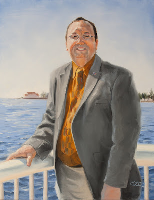
Bob Neal


If you've ever heard or have ever been to Ludington, inevitably there will be at least one of two things you know about it: The Car Ferry named the Badger that sails passengers across Lake Michigan to Manitouwak, Wisconsion, and House of Flavor's Ice Cream.

House of Flavors is owned by Bob Neal. This restaurant and ice cream parlor is so popular that it's even mentioned in a "Pure Michigan" ad for Ludington. There are most definitely over 31 flavors (beat that Baskin Robbins) and they are all made here in Ludington. Actually, my first job (and my brother's also) was being a "cone-y" or kid who scoops ice cream at House of Flavors. The business has had a significant impact on the area, to say the least.

But Bob Neal has done much more for the area than simply House of Flavors. An overriding theme that I'm discovering with all of my portrait subjects is that Ludington is a special and beautiful place- a place where you can leave your car unlocked and not worry about someone stealing anything. So Mr. Neal has decided to give back in other ways too. He's set up some condos by the city's marina with underground parking- much like they have back in Colorado where Mr. Neal spends some of his year. The condos are a beautiful addition, and have been very successful. Mr. Neal also owns some of the surrounding blocks around House of Flavors, and he has done an excellent job of attracting local businesses that have helped stimulate the cities economy, and as always, the blocks look beautiful.

So, it is my pleasure to once again to paint someone who has been so influential in helping Ludington to be a beautiful, prosperous city. Bob isn't quite done yet, but he's very close. The photo I've included is the progress on the painting thus far. Next up, my last portrait! Bill and Jane Carpenter.

Saturday, July 31, 2010

Wish you were here!


Here is my submission for the Ludington Art Center's postcard exhibit. This was quick and fun, and a nice change of pace. I really enjoyed doing it!

Tuesday, July 27, 2010

Post Card Exhibit


The Ludington Area Center for the Arts is putting on a postcard show. Each postcard sells for $30, with $15 going to the Center. I decided to submit something as an excuse to do something digital! I never thought I'd miss it so much, but after all this painting, it's been fun to do. It's not done yet, partly because my mechanical engineering boyfriend keeps telling me my clouds aren't right. I trust him, because he's looking at it from a completely fresh and pedestrian point of view, rather than me with my grandiose vision. It's been good! Even though he keeps telling me that the clouds look like coral, or that it looks like she's running away from something burning and the float plane was her last chance to escape safely. Ah... 'out of the mouths of babes'. But honestly, he's been pushing me towards a stronger piece. Thanks Chris!

Getting closer...


My show is coming in seventeen days! Everything is coming along. Two more paintings to go.

Thursday, July 22, 2010

Budde Reed progress


Here's the latest progress on Budde. The show is getting closer! Two more paintings to go and I'll make my 10 portrait goal.

Friday, July 9, 2010

Milan "Budde" Reed

Hey all, sorry about the delay in posts. The 4th of July holiday has been treating me well. But don't worry, because I've still been busy at work on the Ludington Show.

Here is progress on my latest portrait, Milan "Budde" Reed. And yes, he is related to Todd and Brad- the photographers I had done earlier in the series. Mr. Reed is another very philanthropic resident of Ludington (for instance he has helped donate to the Ludington Arts Center), he is also the third generation owner of Ludington Beverage Company, Inc., chairman of the city of Ludington building authority and member of the board of directors of West Shore Bank. He was nice enough to come visit me in my studio prior to me taking reference photos of him in his office at the beverage company. I asked him why give back, and to Ludington of all places?

Mr. Reed said that more than money, he felt above all that it was important to give one's time. To make yourself available to the community and that sharing that community togetherness was what was most important in giving back, and that the time one puts in is what gets things rolling and happening. Mr. Reed stays in Ludington given that the Ludington Beverage Company has stayed in the family for three generations, which in this sort of day and age and economic climite is almost unheard of. Ludington, he says, is a special place, and while it may not have a ton of career opportunities, it is a city that can always be improved upon, which will hopefully encourage people to come and for the younger generations to stay, and at the same time should be preserved for future visitors. He had a lot of really good things to say, and it makes me wonder why more people don't volunteer in communities across the nation. Philanthropic and volunteer actions such as Mr. Reeds are part of what make great cities happen.


Alright. So. Even now, with the reproduction of the photograph on my camera and on here, I can see that some value relationships need to be tweeked. The spot on the nose has gotten too dark, and the piece of paper on the table looks like it's glowing from within! So, there's work to be done. I won't be posting again for quite a while, I will be in Pasadena at The Illustration Conference, which I am extremely excited about! I will be a volunteer there, but hopefully it will present some good networking possibilities. Wish me luck!

Tuesday, June 29, 2010

Business card final


Here's what I decided on for my business card. I haven't received them yet, but I ordered them through overnightprints.com. My excellent teacher Dave Chow suggested the website to me, and it's great because there are tons of coupon codes you can find on the internet that work. I got 100 premium business cards for free! So, it's worth checking out.

Sunday, June 27, 2010

Lee and Joan Schoenherr


Sorry I haven't been posting my progress recently, I've just been concentrating pretty hard on getting this one right.

Lee and Joan Schoenherr own Floracraft here in Ludington. Don't think that means anything to you, my dear Detroit friends? Well, let me just say that Floracraft ships their products worldwide. They are the largest fabricator and supplier of styrofoam. That's right styrofoam(tm). I can guarantee that just about every Michael's craft store you've ever been to has Floracraft products. And Floracraft has been in business for 60 years! Congrats to them!

Apart from being successful business owners, the reason I'm painting Lee and Joan is because they are also extremely philanthropic people. For instance, they have donated this sculpture, entitled "Reflections" to our marina, which happens to also be my favorite:


Philanthropic, and have good taste! I haven't had a chance to really sit down and discuss the ins and outs of why the Schoenherr's enjoy and stay in Ludington, but I will when I return the reference photos I borrowed from Joan. The Schoenherr's are also very busy people, and for that reason I have borrowed several photos from which I'm drawing my reference from. Here's the piece so far. It's given me a little more grief than Todd and Brad. For instance, there is something in the eyes of Lee that is off and I just haven't nailed it yet. It's ruining the likeness, so it's going to take some more careful consideration. Also, hands aren't done, and there are little details yet, but I wanted to show off something. I should finish by tomorrow, and then, on to the next!

Wednesday, June 23, 2010

And now for something completely different....

Business cards! It's about time I had some, and they will come in quite handy when I go to ICON in a couple weeks in Pasadena. Won't you please let me know which of these you prefer? I'm leaning towards Anna Lisa, but I do like the clean look of the black buck.


Friday, June 18, 2010

Todd and Brad Reed Progress


To do:
-HANDS
-Todd coat
-bottom of camera
-Brad pants
-lighter in Brad's hair
-corners of Todd's mouth
-glaze grass yellow
-Brad left eye?
-light on Brad's ear
-Brad elbow too crisp
-Todd eyebrows?
-glaze all when dry

Wednesday, June 16, 2010

Dr. Anderson completed, Todd and Brad progress

Well, here he is! He turned out just dandy. Unfortunately, I cannot for the life of me get the lighting to reveal the correct colors. All of my camera settings are either too yellow, or too blue, or too dark or too light. This is a little too yellow, and too bright. I should really learn more about my camera, or get a slightly more advanced one anyway (another thing to add to the list of things to get before I'm out of school!) But trust me, the painting is lovely in person.


Also, here is part of yesterday's and today's progress with Todd and Brad. It's coming along nicely, but wouldn't you know it... guess who STILL didn't set down her darkest darks to compare the other values to? !!!!!! GAH! Maybe if I repaint the shadow portion of the third and fourth faces of this project, maybe THEN I will FINALLY learn to set down all of the LIGHTS and all of the DARKS in the BEGINNING! Anyway... it will just fine, but it is something I really have to remind myself to do as a painter.


To those of you non painters, what I'm experiencing with the shadows on the skin tones in my paintings is kind of like this optical illusion. A and B are actually the same color, but A looks darker and B looks lighter. Why? Because A is next to a much lighter color. The light square and A really are that different, but in comparison to black, or to a much darker grey like the squares next to B, that color is actually quite light. In an effort to not rest my hand in paint, I've tried to paint the faces of my portraits first. They look great, until I add all of the surrounding darks, and then, like moving square A for square B, I now have a 30% dark value as opposed to what I thought was a 70% when all that was around the paint was white canvas. Does that make sense? So yes. Something to definitely work on. Save myself some time and effort!

Tuesday, June 15, 2010

Todd and Brad Reed

I know I haven't posted the final painting of Dr. Bill Anderson, but there are some final touch ups to be done once the painting isn't so wet. Actually, that might get to happen today. We shall see! In any case, it should be completely done very soon.

Next up: Todd and Brad Reed. The Reeds are a very artistic bunch. Todd has been photographing the Ludington area and Michigan for many years, and Brad has joined the family business within the last few years. On a side note, Todd's nephew Ryan Reed is also a photographer, and has recently done a project in Sudan. You can visit Ryan's website here.

But back to Todd and Brad. Those of you who know me well know that photography is not something I get excited about very easily. Maybe it's because it is so accessible these days that anyone feels they can call themselves a photographer. That being said, I have always enjoyed the Reed's photographs. Photographing a tourist trap like Ludington and still being able to create pieces that are unique and interesting to look at is no small feat. Todd and Brad really know how to capture the essence of Ludington and Michigan without doing anything that feels overdone or tiresome, or anything that relies too heavily on camera "tricks". And that is what I find so appealing about their work. Also, I just really enjoy the subject matter! In addition to their great photographs, the work they do really does a lot to help stimulate the Ludington economy (for instance, they try to work with local businesses- I know this because in the past I have had to cut and put together 1,000+ double mats for their pieces when I worked at the Artist Market). For that reason, they have also been named business of the year here in Ludington. Lastly, they are all really nice and exceptional people. And that really makes it a joy to work on this particular portrait. You can visit Todd and Brad's website here.

Todd and Brad were nice enough to supply me with some of their own photographs to work from, because I wanted to do a painting of them in the field. Some of you may feel this is cheating, but let me just say that no illustrator works strictly from one photograph. In fact, a lot of it becomes intuition, or artistic license. There are problems with every photograph for an artist. For instance, look at this great one that I'm pulling most of my reference from


Looks great right? Well yes, the lighting is very nice, and I like the green background because the other portraits are mostly blue... but there is the issue of both of them squinting. This can cause more wrinkles than necessary to create a likeness, and may even give the impression of disgust or anger if done strictly from a photograph. Therefore, it is necessary to work from more than one photograph to come to a nice in between squint that will help to make them look a little more natural- and the viewer will never know! The intuition I feel comes most handy when it comes to color. I like to retain realism in my work, but I love pushing color just a little more than it looks in reality on skin tones. I feel it just makes the work so much more interesting. If I made everything look exactly like a photograph, how interesting would that be for me or my viewers looking at paintings? Also, intuition and know how come into play as far as brush strokes and edges. Interest can be created by doing tight detail in the area of focus, and then "blurring" (I don't like that word here, it's a little misleading) the edges that are unimportant. That is a simplified explanation of what I'm trying to do.

Lastly, here's the sketch of the heads I will be using. I know it's not the best photo of the sketch, but notice how the eyes are a little wider, yet still squinted, and how I've made the decision to make Brad smile with teeth as opposed to the photo version where his mouth is pursed. He looks like he's really tired of squinting in the sun. Also, here's the color studies. I like the top better, and I'm excited about using lots more green and less blue. I think it will help the work as a whole to not have everything have copious amounts of cobalt blue.